
Simplifying ‘The Museum of the City of New York’
MCNY Rebrand
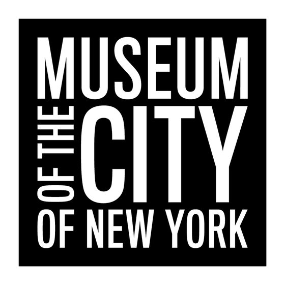
The Museum of the City of New York's rebranding aims to capture its essence in a clean, timeless logo and branding while making it more legible by simplifying visual elements, referencing the shape of its building, and using clean typography for legibility. The goal is to create a cohesive identity that resonates with tradition and modernism.

Communicating the museum’s rich history and cultural significance with clarity and elegance. This will allow the brand to stand out and remain versatile and adaptable across various platforms and applications.

Converting the museum's title into an acronym helped break down the lengthy name.

Breaking down the elements and keeping the simple black-and-white colour palette created a brandable logo/logomark that can be put anywhere.

Extensive, bold and straightforward, Just like New York. Simple solutions often lead to many possibilities.