
Making myself stand out.
Personal Branding

The branding embraces minimalism with a simple colour palette to convey clarity and consistency. The goal is to create bold and fun contrast.

Exploring the potential variations of my logo/wordmark and graphic elements helped me see my brand's options. Doing this set a concrete base and showed versatility. This project was to highlight my vibrant and straightforward personality while also communicating my love for '90s/'2000s retro design. Tilting the elements and wordmark helps communicate my fun and quirky character traits.
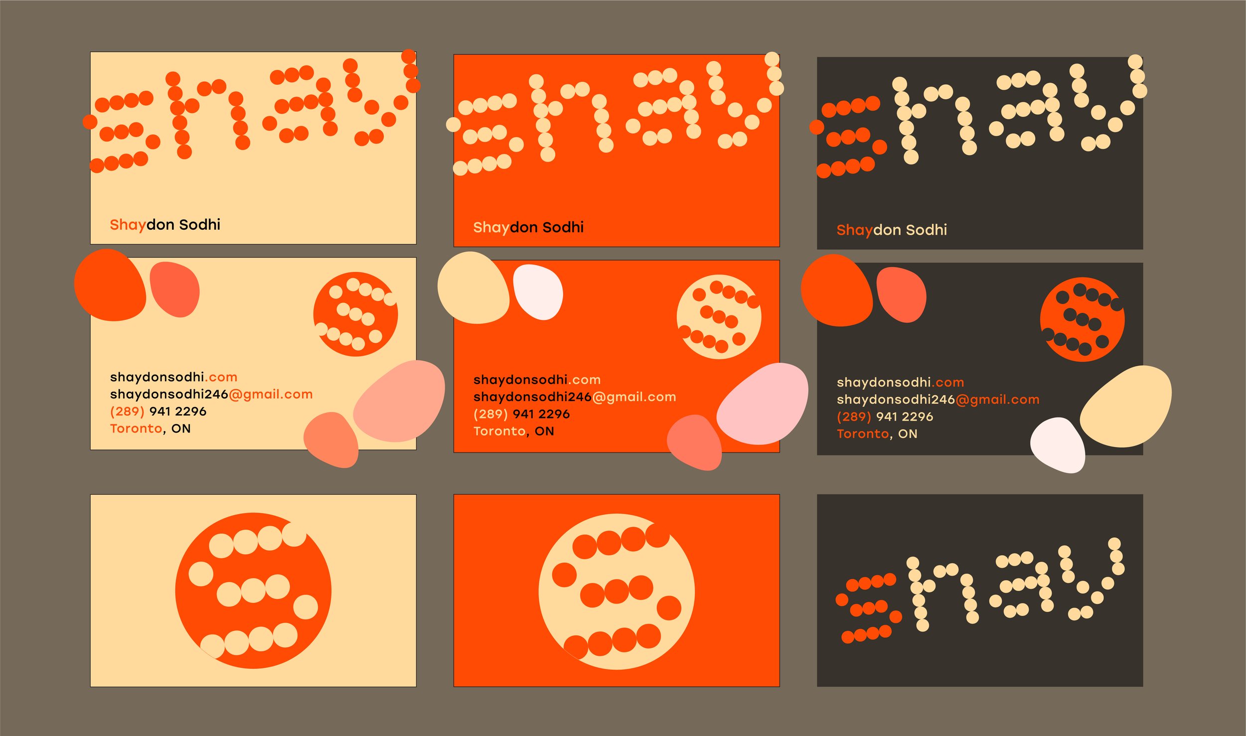
The business cards also consisted of the three colours within the palette, accompanied by secondary graphic elements to fill the negative space, add visual interest, maintain balance, and lead the viewer's eye toward important information.